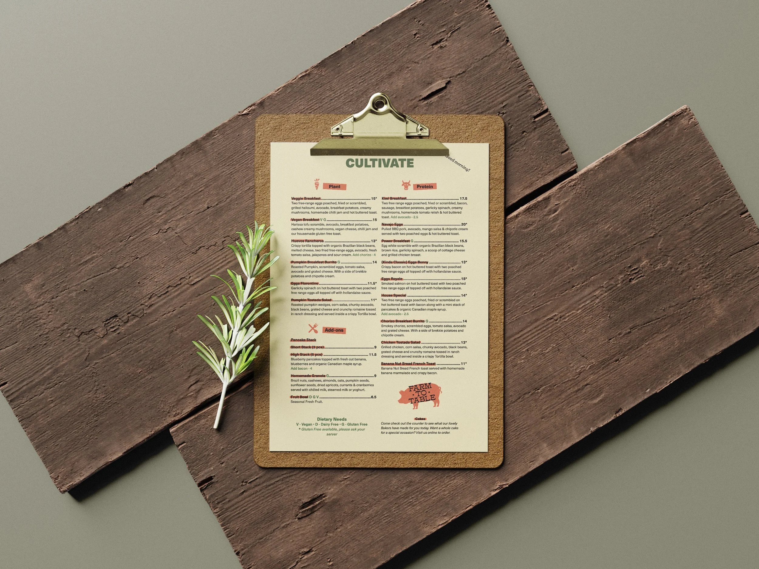

With this Menu design I was going for a modern, farm to table, health conscience restaurant. I chose a typeface that fits that style and is clean and easy to read. I also chose a secondary accent font to create a little more interest in the design and bring in a little bit of those farm to table, rustic feelings. I used a lot of the primary fonts different styles to create that sense of hierarchy and also make it easier to navigate. Color palette was something that was a little tricky for me to pick. I started by having the cream background color and the reddish one. This felt a little too old or vintage and didn’t incorporate enough of the modern, clean, health conscience feeling I was trying to achieve. I added the green, which is often used in this way and I think that got my design to the point I wanted with the color. The primary thing I used in my design to bring the hierarchy to the next level, was the colored boxes behind specific text to emphasize it and make to easy to quickly navigate to it on the menu. The other two things I think I really used to create hierarchy is color and scale of the elements in my design.

Previous
Previous
LITTLE PRINCE BOOK COVERS
Next
Next